


The Power of Color: How to Use Color Psychology in Your Art
Color is more than just a visual element—it’s a powerful tool that can evoke emotions, convey messages, and shape the way people experience art. Whether you’re creating a painting, designing an installation, or crafting digital art, understanding color psychology can significantly enhance the emotional impact of your work. In this article, we’ll explore how different colors influence viewers and how you can harness the power of color psychology to elevate your art.
The Emotional Impact of Warm Colors
Warm colors, like reds, oranges, and yellows, are known to evoke strong emotions. These colors are often associated with energy, passion, and warmth, making them ideal for pieces that aim to inspire action, excitement, or intensity. Red, for example, is often linked to feelings of love or anger, while yellow can evoke feelings of happiness and optimism.
Incorporating warm colors into your art can add a sense of urgency or vitality. For instance, a predominantly red painting might evoke strong emotions related to passion or conflict. These colors can grab the viewer’s attention immediately, making them feel a visceral connection to the piece.
Tip: Use warm colors in areas of your artwork where you want to draw the viewer’s focus or create a sense of energy and movement. These shades work well in abstract art or emotionally charged scenes.
Cool Colors for Calm and Reflection
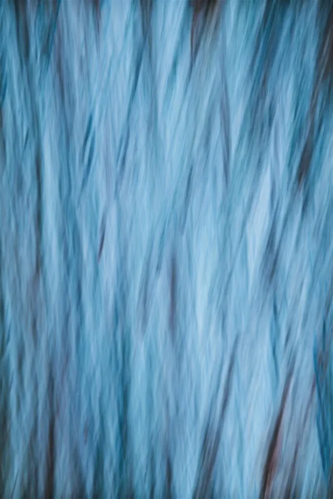
On the opposite side of the spectrum, cool colors like blues, greens, and purples evoke calmness, tranquility, and introspection. Blue, for instance, is often associated with peace, trust, and stability. Green connects us to nature, growth, and renewal, while purple can evoke mystery, luxury, or spirituality.
If your goal is to create art that encourages the viewer to reflect, relax, or feel serene, cool tones are your go-to. A serene landscape in shades of blue and green, for instance, can invoke a sense of calm and well-being. Cool colors work well in pieces meant to soothe or create a contemplative mood.
Tip: Cool colors are ideal for backgrounds or for creating space and depth in your art. If you’re working on a piece with a meditative or peaceful theme, these shades can reinforce the sense of stillness or reflection.
Neutral Colors for Balance and Subtlety
Neutral colors, such as whites, grays, browns, and blacks, may not draw immediate attention like bright hues, but they play a crucial role in balancing and grounding your artwork. Neutrals can create contrast, emphasize focal points, or serve as a calming backdrop for more vibrant colors. They also add a sense of sophistication and subtlety to a piece.
White is often associated with purity, simplicity, and clarity, while black can evoke power, mystery, or elegance. Gray tones add balance and a modern feel, while brown can evoke warmth and earthiness. Using neutral colors allows other colors to shine, offering a background that lets more dynamic shades take center stage.
Tip: Use neutral colors to create contrast and help more vivid colors stand out. They are perfect for creating minimalist designs or balancing out bolder color schemes.
Color Harmony: The Secret to Balanced Art
Color harmony refers to the pleasing arrangement of colors in a composition. When colors work together harmoniously, they create a sense of balance and visual cohesion, making the artwork more engaging and aesthetically satisfying. Understanding color theory can help you choose complementary or analogous colors that enhance your piece.
Complementary colors—such as red and green or blue and orange—sit opposite each other on the color wheel and, when used together, create high contrast and vibrant compositions. Analogous colors, which are next to each other on the color wheel (such as blue, green, and teal), create a more harmonious and serene look.
Tip: Use a color wheel to experiment with different combinations. Complementary colors are great for bold, attention-grabbing art, while analogous colors can create softer, more harmonious designs.
How to Evoke Specific Emotions with Color Combinations
Combining colors allows you to evoke specific emotions and responses. A bright, bold palette filled with contrasting warm and cool tones can create a feeling of excitement or tension, while a muted, monochromatic palette can instill a sense of calm or nostalgia.
For instance, pairing red and black might evoke feelings of power, danger, or passion, making it perfect for dramatic pieces. In contrast, a combination of pastel pinks, yellows, and blues can evoke a sense of childhood innocence, warmth, or joy. The right color combinations can reinforce the message you want to communicate through your artwork.
Tip: Before starting your piece, decide what emotions you want to evoke in the viewer. Then, select colors that will reinforce those feelings. Test out different combinations by creating small swatches or digital mock-ups before committing to a full piece.
The Cultural Significance of Color
Color doesn’t just evoke personal emotions; it also carries cultural meanings that can vary from place to place. In Western cultures, white is often associated with purity and weddings, but in some Eastern cultures, it symbolizes mourning and death. Red is seen as a color of passion in the West, but in China, it represents good fortune and celebration.
When creating art that will be viewed by a global audience or when incorporating cultural themes, it’s important to consider these varying interpretations. Understanding the cultural significance of colors can add layers of meaning to your work and help you communicate more effectively across different contexts.
Tip: Research the cultural associations of colors when creating art with cultural or symbolic elements. This can help you avoid misunderstandings and create work that resonates on a deeper level with your audience.
Color and Personal Expression
Ultimately, color is a deeply personal tool for artists. While color theory and psychology provide guidelines, the way you use color is a form of self-expression. Some artists thrive on bold, intense palettes, while others prefer subdued, minimalist tones. Understanding your own relationship with color will help you make more intentional choices in your art.
Take note of the colors you’re naturally drawn to and explore how they align with your creative voice. Whether you want to provoke, calm, or challenge your audience, color can be the key to conveying your message with impact.
Tip: Start experimenting with a personal color journal. Track which colors you use most frequently and how they make you feel. Over time, this will help you develop a color palette that feels authentic to your artistic style.
Color is one of the most powerful tools at your disposal as an artist. By understanding the psychological and emotional impact of color, you can create work that resonates more deeply with your audience. Whether you’re using vibrant reds to inspire energy or calming blues to evoke serenity, the colors you choose shape how viewers experience your art. Don’t be afraid to experiment, explore different combinations, and harness the power of color to elevate your creative expression.
[DISPLAY_ULTIMATE_SOCIAL_ICONS]


